

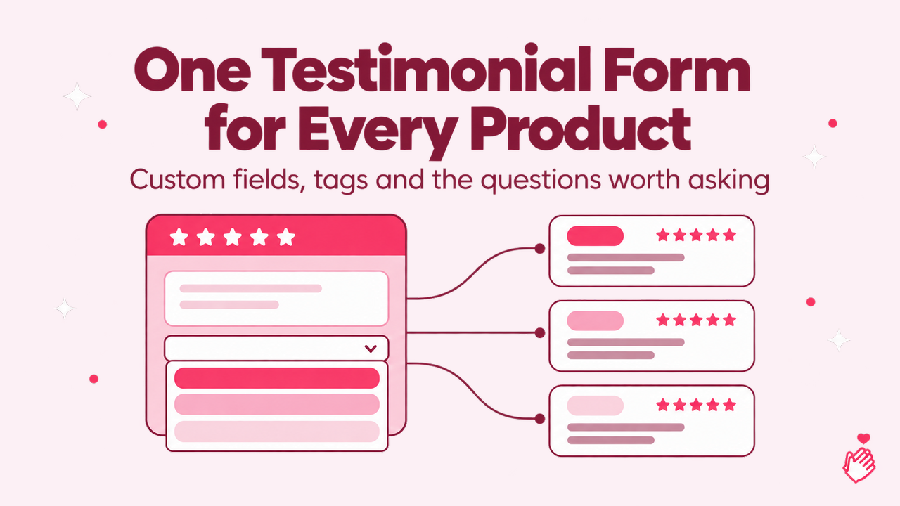
A review is worth more when you know what it is about. "Great product, fast shipping" is fine on a homepage. On the product page for the trail runners it is a review of the trail runners, and on the product page for the sandals it is noise. Most testimonial setups cannot tell the difference, because the form that collected the review never asked.
The usual fixes are a form per product, which means a link per product, a different email per product and a tagging chore whenever someone uses the wrong link, or a person reading each review and tagging it by hand. There is a third way: one form, one dropdown, and tags that apply themselves. Below is how to set that up, and then the other questions a form can ask once you accept that a testimonial form can collect more than a testimonial.
Why sorting matters more than it used to
Two findings from the research on how people read reviews explain why "which product" is the question to ask first.
The first is about volume. Northwestern's Spiegel Research Center studied purchase data from three online retailers with PowerReviews and found that a product with five reviews was 270% more likely to be bought than a product with none, and that the gain flattened after those first five. For a higher-priced product the lift was 380%. Five reviews is not many. The problem is that a store with 300 reviews and 40 products usually has five reviews on three products and none on the rest, because nothing routed them.
The second is about what readers look for. BrightLocal's 2026 Local Consumer Review Survey, 1,002 US adults, asked which qualities make a review believable. The top answer, at 56%, was consistent sentiment across several reviews, ahead of a description of a positive experience at 46%, a review posted within the last month at 44% and a high star rating at 42%. Consistency across several reviews only exists when several reviews are about the same thing. A product page showing four reviews of the same product, all saying the fit runs small and the sole lasts, is what 56% of readers are looking for. The same four reviews scattered across a general testimonials page are not.
The dropdown that tags for you
In Shapo, a collection form can carry custom fields, and one of the field types is a dropdown whose options map to tags in your workspace. Set it up once:
- Create the tags you already filter widgets by, one per product, service or location. If you have a "Trail runners" widget on the trail runners page, you already have this tag.
- Add a dropdown field to the form. Label it the way a customer would read it: "Which product did you buy?" or "Which service did we help with?"
- Give each option a tag. "Trail runners" the option maps to Trail runners the tag. Options do not have to be named after the tag; "The shoes I run in" can map to the same tag if that is how customers talk.
- Make the field required if every review needs a home, or optional with an "Other" choice that maps to nothing, so a review about your customer service does not have to pretend to be about a product.
From then on a review that picks "Trail runners" arrives with that tag, the trail runners page widget shows it and the sandals page widget does not. The form's own default tags still apply on top, so a review can be both "Trail runners" and "Spring campaign" without anyone touching it.
One form is now enough for the whole catalogue. The link on the receipt, the link in the follow-up email and the QR code on the packaging can all be the same link.
Which product did you buy? *
- Trail runnerstrail-runners
- Road shoesroad-shoes
- Sandalssandals
Each option adds its tag to the review
yourstore.com/products/trail-runners
Widget filtered to trail-runners
- Maya R.★★★★★
Grip on wet rock is the best I have had.
- Tom K.★★★★★
Fit runs a little small, sole lasts forever.
Services, locations and plans work the same way
The product example is the obvious one, but the mechanism is "one option, one tag", and a tag can mean anything.
An agency with four services asks "What did we work on together?" and the web design reviews stop appearing on the SEO page. A clinic with three locations asks "Which clinic did you visit?" and each location's Google-style review widget shows its own patients. A software company asks "Which plan are you on?" and the enterprise page shows enterprise customers. A course creator asks "Which course did you take?" and each sales page carries its own students.
The rule of thumb: if you have, or want, a separate widget for it, it deserves an option in the dropdown.
The other questions worth asking
Once a form asks one extra question, the question becomes which others earn their place. A testimonial form has to stay short. The customer is doing you a favour and every field is a chance to close the tab. Kantar's research on survey abandonment found that a block of 14 rating statements had a 12% dropout against 2% for a block of six, and SurveyMonkey's analysis of about 100,000 surveys found that respondents spend about 75 seconds on the first question and around 30 seconds on each of questions three to ten, getting faster and less careful as they go. Two or three custom questions is the budget. Shapo caps it at two on the free plan and ten on Pro, and ten is a ceiling, not a target.
These are the ones that pay for themselves.
Permission to quote. A checkbox: "You may use my words in marketing." It travels with the review, so nobody has to email the customer six months later to ask. A second checkbox, "You may contact me about my experience," turns a happy customer into a case study candidate without a separate outreach.
Time as a customer. A dropdown: less than a month, one to six months, six months to two years, longer. "Great service" from someone in their third year reads differently from "great service" after a week, and the answer sits with the review in the dashboard, so the team can pick the long-tenured ones for the pricing page.
The recommendation question. An NPS field, 0 to 10, on the personal details step. The form analytics page then reports a Net Promoter Score from people who also left a review, with the distribution, and because the review is tagged you know which product the score belongs to. It is not a replacement for asking NPS on the site, where you reach customers who would never write a review, and the NPS survey is the tool for that. It is a cheap second reading from a group you already have.
What almost stopped you. A short text field: "What nearly made you not buy?" The answers are objections in the customer's words, and the ones that come from happy customers are the objections your sales page should answer. This is the one question that makes the marketing team read the form responses.
Where the answers go, and where they do not
Custom field answers are private. They show on the testimonial in your dashboard, they are a column in the CSV export, and they are summarised on the form's analytics page: a count per dropdown option, so you can see which product gets reviewed most; how many ticked each checkbox; the NPS score and distribution; and the latest text answers with who wrote them. They never appear on a widget, in the Wall of Love or anywhere a visitor can see. The public side of a review is the rating, the words, the name and the details the reviewer agreed to show.
Which product did you buy?
114 answers- Trail runners64 (56%)
- Road shoes41 (36%)
- Sandals9 (8%)
OK to quote me
87%
ticked, of all submissions
What nearly stopped you?
"Not sure about the sizing online."
"Shipping cost until I saw the free returns."
That separation is what makes it safe to ask a question like "what nearly stopped you". The customer is telling you, not the internet.
A form that does this in five minutes
For a store with three product lines, the form is: the rating, the review, an optional photo or video, the name and email, then two custom fields. "Which product did you buy?" as a required dropdown mapped to three tags. "You may use my words on our website" as a checkbox the customer ticks themselves. Optionally the NPS field. That is the whole form, and it is shorter than most contact forms.
Send the link after delivery, embed the form on a thank-you page, or put it in an email campaign to the last quarter's customers. Reviews arrive tagged, the product pages fill in, and the analytics page tells you which product line nobody reviews. That is feedback too.