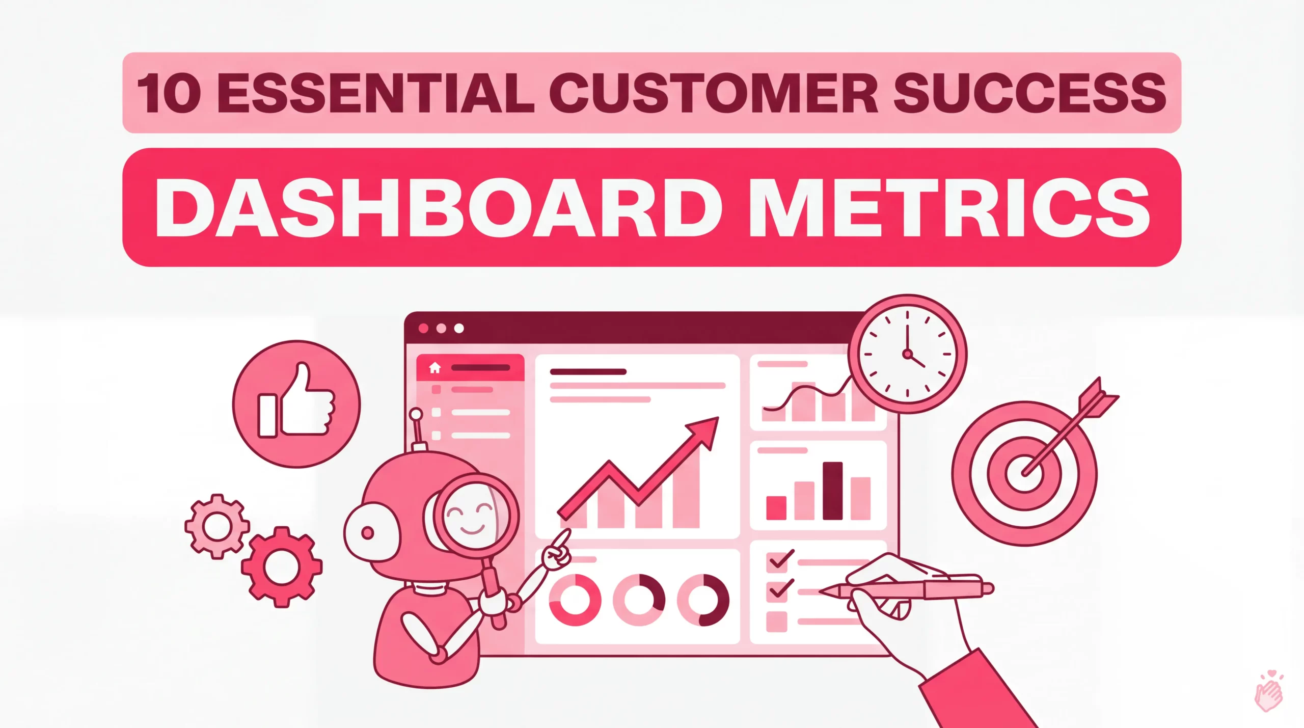
A customer success dashboard is a centralized, visual tool that displays key metrics—like health scores, churn rates, and engagement levels—in one place. It pulls data from your CRM, product analytics, and support systems. It gives CS teams a single view of account status so they can spot at-risk customers and take action before small issues become cancellations.
The challenge is knowing which metrics actually matter. This guide covers the 10 KPIs that belong on every customer success dashboard and the different dashboard types for different roles. It also explains how to turn internal customer data into external social proof that builds trust with prospects.
Key Takeaways
What Is a Customer Success Dashboard
A customer success dashboard is a data visualization tool that displays critical metrics—like health scores, product usage, and retention rates—in one centralized view. It pulls information from your CRM, support system, and product analytics so you can monitor customer relationships without jumping between tools.
The goal is simple: give Customer Success Managers (CSMs) what they need to identify red flags and prioritize outreach. Teams can then act before small issues become churn. Most dashboards include:
Why Customer Success Dashboards Matter
Without visibility into customer health, you’re reacting to problems instead of preventing them. A well-built dashboard transforms scattered data into a clear picture of which accounts are thriving and which ones need attention.
Here’s what a solid CS dashboard enables:
10 Essential Customer Success Metrics Dashboard KPIs
These are the KPIs that belong on every csm dashboard. Each one tells you something different about your customers’ health and your team’s performance.
Customer Health Score
A customer health score combines multiple signals—product usage, support tickets, NPS responses, engagement frequency—into a single risk indicator. Most teams use red/yellow/green scoring to quickly identify which accounts need immediate attention.
A dropping health score is often your earliest warning sign. You might notice usage declining weeks before a customer mentions they’re shopping for alternatives.
Net Revenue Retention
NRR measures the percentage of recurring revenue you retain from existing customers, including expansions, contractions, and churn. Many CS teams treat it as their north star metric because it captures both retention and growth in one number.
A healthy SaaS company typically targets NRR above 100%, meaning expansion revenue outpaces losses—though median NRR has compressed to 101%, leaving little room for error.
Customer Churn Rate
Churn rate tracks the percentage of customers who cancel or don’t renew within a specific period. It’s worth distinguishing between logo churn (number of customers lost) and revenue churn (dollar value lost)—they can tell very different stories.
Losing three small accounts looks similar to losing one enterprise customer in logo churn, but the revenue impact is completely different.
Net Promoter Score
NPS measures customer loyalty by asking how likely someone is to recommend your product. Scores range from -100 to 100, calculated by subtracting detractors (0-6) from promoters (9-10).
The real value isn’t the score itself—it’s the follow-up. Acting on detractor feedback—especially responding to negative reviews promptly—often reveals exactly what’s broken.
Customer Lifetime Value
CLV represents the total revenue you expect from a customer over the entire relationship. This metric helps you prioritize high-value accounts and make smarter decisions about how much to invest in their success.
Product Adoption Rate
Product adoption rate tracks the percentage of customers actively using key features. Low adoption often signals onboarding issues, poor product-market fit, or simply that customers don’t know certain features exist.
If customers aren’t using high-value features, they’re unlikely to renew. Companies leveraging product usage data report 15% higher retention rates than those that don’t.
Time to Value
TTV measures how long it takes a new customer to achieve their first meaningful outcome. Faster time to value correlates with higher retention—customers who see results quickly tend to stick around.
Support Ticket Volume and Trends
The number and pattern of support requests per account can reveal friction points. A sudden spike in tickets from a previously quiet customer often indicates something’s wrong.
Look for trends, not just totals. Is ticket volume increasing over time? Are certain features generating more issues?
Renewal Rate
Renewal rate tracks the percentage of customers who renew their subscription or contract. Segmenting by cohort, plan type, or customer size gives you more actionable insights than a single company-wide number.
Customer Sentiment and Voice of Customer Score
Qualitative feedback from surveys, reviews, and testimonials adds context that numbers alone can’t provide. Structured customer feedback management helps you understand the “why” behind customer behavior.
Tools like Shapo collect and centralize feedback from multiple sources—Google reviews, social media, and direct testimonials. This ensures you’re not missing valuable signals scattered across the internet.
Types of Customer Success Dashboards
Different dashboards serve different purposes. The right choice depends on who’s using it and what decisions they’re making.
Customer Health Dashboard
Focused on account-level health scores and risk indicators. This is the daily driver for most CSMs—showing which accounts need immediate attention and which are thriving.
Onboarding Progress Dashboard
Tracks new customer milestones, training completion, and time to value. Implementation teams use this view to ensure customers reach their first success quickly.
Engagement and Usage Dashboard
Monitors login frequency, feature adoption, and activity trends. This helps you identify disengaged accounts before they become churn risks.
Renewal and Expansion Dashboard
Displays upcoming renewals, upsell opportunities, and revenue forecasts. CS leadership and revenue teams rely on this for planning and prioritization.
Support Interaction Dashboard
Aggregates ticket volume, resolution time, and CSAT by account. This helps you spot friction patterns and identify customers who might be struggling silently.
| Dashboard Type | Primary Focus | Best For |
|---|---|---|
| Customer Health | Risk scores and account status | Daily CSM prioritization |
| Onboarding Progress | Milestones and time to value | Implementation teams |
| Engagement and Usage | Feature adoption and activity | Identifying disengaged accounts |
| Renewal and Expansion | Revenue forecasts and upsells | CS leadership |
| Support Interaction | Ticket trends and CSAT | Spotting friction patterns |
How to Build a Customer Success Dashboard
1. Define your most critical success metrics
Start by identifying the KPIs that align with your business goals. Resist the temptation to track everything—dashboards cluttered with metrics create noise, not clarity. Pick 5-10 metrics that actually drive decisions.
2. Centralize data from CRM, support, and product tools
Pull data from Salesforce, HubSpot, Zendesk, Intercom, your product analytics platform, and other sources into one view. Most CS platforms like Gainsight, Totango, or ChurnZero handle this integration automatically.
3. Add qualitative feedback and customer voice data
Numbers tell you what’s happening; customer feedback tells you why. Collect testimonials, survey responses, and review sentiment and include them in your dashboard view. Shapo can help you collect and centralize feedback from 25+ sources into one hub.
4. Set up automated alerts for at-risk accounts
Configure notifications when health scores drop below a threshold or support tickets spike. Automation ensures you catch problems quickly rather than discovering them during a quarterly review.
5. Review and iterate on a regular schedule
Set a cadence—weekly or monthly—to evaluate whether your dashboard is actually driving action. Metrics that seemed important six months ago might be less relevant as your business evolves.
Common CSM Dashboard Mistakes to Avoid
Tracking too many vanity metrics
It’s tempting to add every available data point, but dashboards work best when they’re focused. If a metric doesn’t lead to a specific action, it probably doesn’t belong on your main view.
Ignoring qualitative customer feedback
Health scores and usage data are valuable, but they miss the emotional context. A customer might be using your product daily while actively shopping for alternatives. Reviews, testimonials, and direct feedback fill in these gaps.
Failing to act on insights
A dashboard is only valuable if it drives action. Build workflows that trigger outreach based on alerts—otherwise, you’re just watching numbers change.
Customer Service Dashboard Examples to Inspire Your Design
Looking at how other teams structure their dashboards can spark ideas for your own:
Displaying customer testimonials using social proof tools like Shapo complements internal dashboards by showcasing success externally. This builds trust with prospects while validating your CS efforts.
Display Customer Success with Testimonials and Social Proof
Internal dashboards help your team manage customer relationships. But there’s another side to customer success: showing the world that your customers are thriving.
Showcasing testimonials and reviews as social proof reinforces trust and validates your customer success efforts. When prospects see real customers sharing positive experiences, it builds confidence before they talk to sales. Spiegel Research Center found that displaying reviews can increase conversions by up to 270%.
Ready to showcase your customer success? Sign up for free to start collecting and displaying customer testimonials with Shapo—no credit card required.
FAQs About Customer Success Dashboards
How often should you update a customer success dashboard?
Most teams review dashboards weekly, but automated data syncs typically refresh metrics daily or in real time. The key is ensuring your data is current enough to catch problems before they escalate.
What tools can you use to build a customer success dashboard?
Popular options include Gainsight, Totango, ChurnZero, Custify, and Velaris. You can also build custom dashboards in BI tools like Looker, Tableau, or Google Data Studio connected to your CRM and product data.
Can customer testimonials improve customer success metrics?
Yes—displaying testimonials on your website builds trust with prospects and reinforces value for existing customers. This positive feedback loop can improve NPS, strengthen renewal conversations, and support expansion efforts.
Customer health dashboard vs. csm dashboard: key differences
A customer health dashboard focuses specifically on account risk scores and health indicators. A csm dashboard is a broader term that may include health, engagement, support, and revenue metrics in one unified view for daily customer management.